Engineering note
How to build a design system that keeps its meaning
A good design system is an agreement about meaning. Tokens, one status language, product copy, designed states and enforcement keep a product consistent as it grows.
By Eclar Khalid ·
A design system is often described as a component library with a colour palette. That description covers the visible part. The valuable part is an agreement about meaning: what a colour says, what a word promises, what a screen shows while it waits, and who is allowed to change each of those things.
I built a design system for a dense workforce platform, the kind of product people use all day to approve requests, track deadlines and fix problems under time pressure. These are the principles that made it work, and they apply to any product that has to stay consistent while many people build it.
Start with meaning, then values
Every system has raw values: hex codes, a radius, a type scale, spacing steps.
Components should never use them directly. Between the raw values and the
components sits a layer of semantic tokens, names that describe a job:
primary, border, muted-foreground, success-soft, radius-lg.
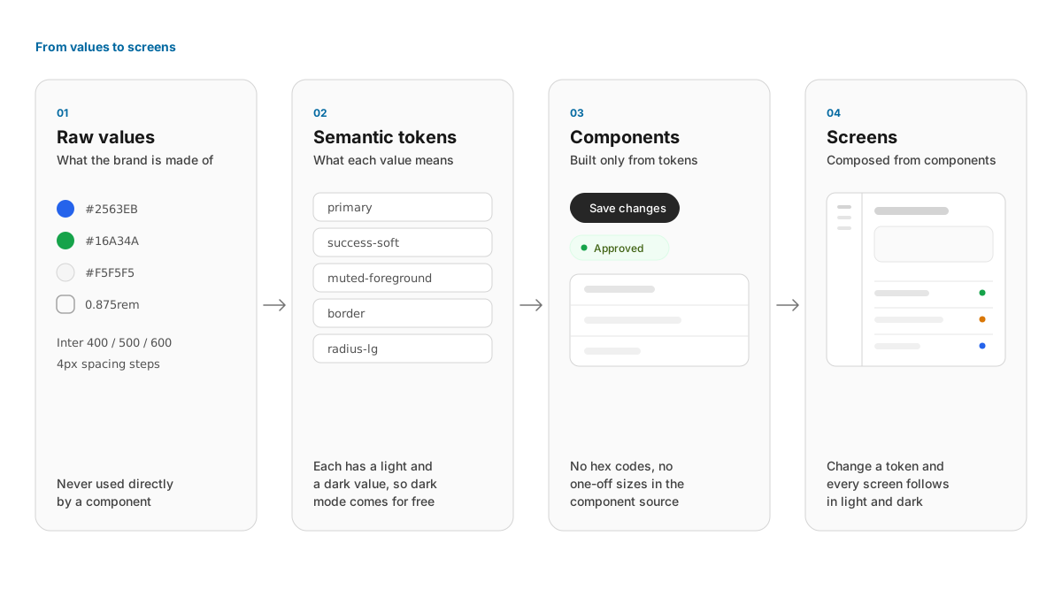
This layer pays for itself quickly:
- Dark mode becomes a property of the token. Every semantic token has a
light value and a dark value, so a component written once works in both.
A literal
#ffffffin a feature page is the one thing that breaks it, so the rule is simple: feature code uses tokens, never literals. - Contrast is solved once. Text tokens are tuned to hold a 4.5:1 contrast
ratio on every surface they are allowed to sit on. A developer choosing
muted-foregroundgets a readable colour without checking it. - Fills and text are separate tokens. The primary colour that fills a
button is often too dark to read as link text on a dark background. A
separate
primary-texttoken, lighter in dark mode, keeps links legible without touching the button.
Give status one language
In an operational product, status is the information people scan for most. It needs one vocabulary that means the same thing on every screen.
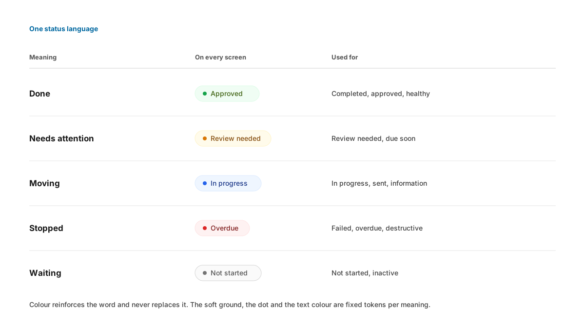
The rules that keep this language trustworthy:
- Each meaning owns a family of tokens: a fill for dots and bars, a soft ground for pills, and a text colour that stays readable on that ground. Mixing them is where contrast bugs come from, so the pairs are documented and the component applies them.
- Colour reinforces a word. A status pill always carries its label. People with colour vision deficiencies, screen reader users and anyone glancing at a printed report all get the same meaning.
- Derived states are calculated, never stored. "Overdue" combines a due date with an incomplete status. Showing it in red is correct; writing it over the stored state would lose the real lifecycle.
- Destructive red is reserved. It marks irreversible outcomes and stops. A failure the system recovered from is information, and it uses the information colour.
- Raw values never reach the screen. An API enum such as
PENDING_REVIEWis mapped to a human label in one utility, so every screen says "Review needed" the same way.
Let the brand change and keep the meaning fixed
Products often let a customer apply their own look. That flexibility needs a clear boundary, or a brand colour ends up competing with status colours.
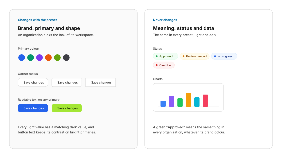
In this system, an organization picks a theme preset for its workspace. A preset can change the primary colour, its readable text variant, the corner radius and the neutral family. It never changes status, chart or avatar colours. A green "Approved" means the same thing in every workspace.
Two further rules keep presets safe. Every light override has a matching dark override, so a preset never leaves a bright surface in dark mode. And a preset with a bright primary, such as lime or amber, ships with a dark foreground colour, so button text keeps its contrast.
Put the words into the system
The words in a product are part of its design. They deserve rules as precise as the colours, written down where designers and engineers will read them.
The rules that mattered most for a product used under pressure:
- State things directly. Write "Three checks failed" in place of a roundabout phrasing such as "Not all checks passed". Write "This is a large change" and "Most mailboxes sync in under a minute". Direct statements are faster to read and harder to misread.
- Keep plain facts and legal limits exactly as written. "This cannot be undone" is a fact. A disclaimer such as "Verification does not guarantee employment" stays word for word, because an affirmative rewrite would widen the promise.
- Keep the tone steady. Errors, empty states and confirmations are written plainly, with no irony or jokes, because the reader may be frustrated.
- Name actions with verbs. Dialog titles are actions ("Reassign task"), and cancel buttons can be specific ("Keep task").
- Errors say what failed and what to do next. "Conversations could not be loaded." followed by a Try again button.
- Success confirms the outcome. "Changes saved" tells the person what happened. A bare "Success" does not.
Design every state, beyond the happy path
A screen spends a surprising share of its life loading, empty, failed or waiting on an action. Each of those moments needs a designed answer.
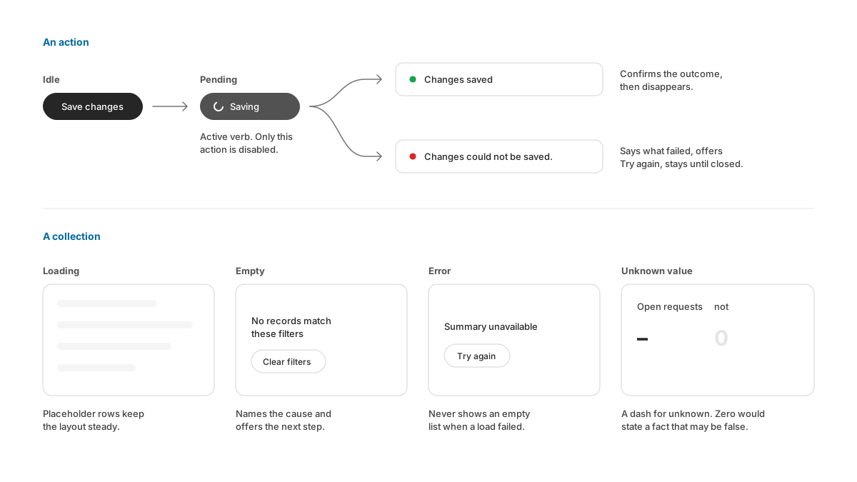
- Pending states use the active verb. A button reads "Saving" while it works, and only the action in flight is disabled. The rest of the screen stays usable.
- Success messages disappear; error messages stay. A person might look away during a save. An error that vanishes after a few seconds is an error they never saw.
- Empty states name the cause. "No records match these filters" offers Clear filters. A collection with nothing in it yet offers the create action.
- Unknown values show a dash. If a summary could not load, it reads "Summary unavailable", and a missing figure shows a dash ("–"). A zero would state a fact that may be false.
Make restraint a rule
Dense products become noisy one reasonable decision at a time: a shadow on a card, a border around a table, a coloured heading. A design system can hold the line with a few explicit rules.
- Borders separate, shadows lift. Cards, tables and sidebars use a thin border and no shadow. Shadows mark only what floats above the page: popovers, menus, sheets and toasts. Elevation then carries meaning.
- Hierarchy comes from spacing and weight first. Font weight steps from regular body text to semibold headings to bold page titles, and spacing groups related things. Extra borders and cards come last.
- One primary action per group. The filled button is the main action, and everything else uses quieter variants.
- Figures align. Money, durations and counts use tabular numerals and right alignment, so columns can be compared at a glance.
Make drift hard
A design system that depends on everyone remembering the rules will drift. The durable version is enforced by the codebase.
- One source for every primitive. Product code imports the shared Button, Table and StatusPill. It never copies them into a feature, because a copy stops receiving fixes.
- Checks in continuous integration. A small script can reject raw table markup in product screens, or hard-coded colours in feature code. A failing build teaches the rule at the moment it matters.
- Documentation next to the components. Each component has a short page with its props, its intended use and its limits. The page describes the real component, because it is written from the real source.
- Honest coverage notes. The documentation lists what it does not cover yet. A team that knows a gap exists can plan for it.
The design principle
Treat a design system as an agreement about meaning. Values serve tokens, tokens serve components, and components serve the people using the product under pressure. When colours, words and states each mean one thing everywhere, and the codebase enforces that, a product can grow quickly and still feel like one product.